React Native API模块 之Alert #
Alert #
(一)概述
Android、iOS平台通用的弹出框Alert模块
该Alert模块是创建弹出一个弹框,显示一个标题以及相关信息内容。该弹出框可以提供一系列的可选按钮,点击任何一个按钮都会调用onPress方法并且关闭弹框。默认情况下,该只会显示一个'确定'按钮。
该模块API是在Android、iOS平台通用的显示静态的弹框。如果需要显示一个提示框可以让用户输入相关信息的,详细请查看AlertIOS;该带输入框的弹框只适用于iOS平台。
(二)iOS平台相关
只有iOS平台可以指定多个数量的button,每个按钮都可以设置特殊的风格,不过风格为'default','cancel','destructive'三种状态之一。
(三)Android平台相关
iOS平台可以指定多个数量的button,但是在Android平台上面最多只能指定三个按钮。Android平台的弹出框的按钮有'中间态','取消','确认'三种状态
1.如果你只有指定了一个按钮,那么该为'positive' (例如:确定)
2.如果你指定了两个按钮,那么该会'negative','positive' (例如:确定,取消)
3.如果你指定了三个按钮,那么该会'neutral','negative','positive'(例如:稍后再说,'确定','取消')
(四)Alert方法
static alert(title:string,message?:string,buttons?:Buttons,type?:AlertType) 该会Alert模块显示弹框的静态方法,有四个参数,分别为标题,信息,按钮,以及按钮的风格类型
(五)Alert使用实例
Alert实例代码如下:
'use strict';
import React, {
AppRegistry,
Component,
StyleSheet,
Text,
View,
Alert,
ToastAndroid,
TouchableHighlight,
} from 'react-native';
class CustomButton extends React.Component {
render() {
return (
<TouchableHighlight
style={styles.button}
underlayColor="#a5a5a5"
onPress={this.props.onPress}>
<Text style={styles.buttonText}>{this.props.text}</Text>
</TouchableHighlight>
);
}
}
class AlertDemo extends Component {
render() {
return (
<View>
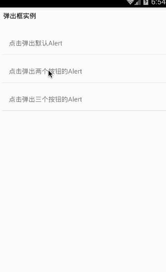
<Text style={{height:30,color:'black',margin:8}}>
弹出框实例
</Text>
<CustomButton text='点击弹出默认Alert'
onPress={()=>Alert.alert('温馨提醒','确定退出吗?')}
/>
<CustomButton text='点击弹出两个按钮的Alert'
onPress={()=>Alert.alert('温馨提醒','确定退出吗?',[
{text:'取消',onPress:()=>ToastAndroid.show('你点击了取消~',ToastAndroid.SHORT)},
{text:'确定',onPress:()=>ToastAndroid.show('你点击了确定~',ToastAndroid.SHORT)}
])}
/>
<CustomButton text='点击弹出三个按钮的Alert'
onPress={()=>Alert.alert('温馨提醒','确定退出吗?',[
{text:'One',onPress:()=>ToastAndroid.show('你点击了One~',ToastAndroid.SHORT)},
{text:'Two',onPress:()=>ToastAndroid.show('你点击了Two~',ToastAndroid.SHORT)},
{text:'Three',onPress:()=>ToastAndroid.show('你点击了Three~',ToastAndroid.SHORT)}
])}
/>
</View>
);
}
}
const styles = StyleSheet.create({
button: {
margin:5,
backgroundColor: 'white',
padding: 15,
borderBottomWidth: StyleSheet.hairlineWidth,
borderBottomColor: '#cdcdcd',
}
});
AppRegistry.registerComponent('AlertDemo', () => AlertDemo);
运行截图如下:
[全文完]
Created by ShenBao